


2024-2025
A Fresh Evolution in our Design System
Introducing Nova
Lead Designer
With Nova, we set out to bring clarity to creative chaos—building a cohesive system that ensures consistency while reflecting our brand’s values.
From color and typography to components and interactions, Nova is a scalable, intuitive design language that feels uniquely ours.


When Speed Caught Up With Us
As the sole designer at that time in a fast-moving startup, my focus was on getting the product out the door fast. In just two weeks, we crafted an entire product experience—leaning on instinct, speed, and makeshift solutions to meet tight deadlines. At the time, deeply considering every design detail wasn’t a luxury we could afford.
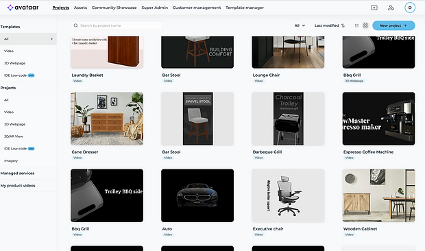
But as the product grew and new features piled on, the cracks began to show—visually inconsistent elements, duplicated components, and a lack of cohesion that started slowing us down. The need of the hour had been speed, but now, that very speed was catching up with us.
Problems with the current Design System.


Color Chaos
With no central color system in place, developers pulled hex codes directly from design files. Over time, this led to a bloated codebase with 400+ unique colors, many of them near-identical. Maintaining visual consistency or even finding the right shade, became nearly impossible.
Here in the images you can see that the greys used across interfaces vary noticeably, some feel too dominant and cold. Black lacks contrast against the primary blue, and the primary button’s hover state turns a heavy indigo as shown in image below, creating visual inconsistency.


Inconsistent UI Patterns
Buttons, inputs, modals, and other components lacked visual or behavioral consistency. Each new feature often introduced small design variations—different padding here, a new corner radius there which led to visual noise and confused users.
Here in the images, you can see that the typography is either too bold or too light. One screen leans towards a bluish theme, while the other uses a completely neutral grey palette.Even basic components like Filter and Sort lack consistency in style and hierarchy across screens.


Outdated Visual Language
As the brand began transitioning toward a more AI-driven and lifestyle-focused direction, the existing UI no longer aligned with that vision. The design felt dated and failed to capture the evolving tone and personality of the product.


Light & Dark Mode Complexity
Switching between light and dark modes was a major pain point. Because colors and backgrounds were applied screen-by-screen, the entire UI had to be manually adjusted, making theming inefficient and error-prone.


Developer Confusion & Code Duplication
Switching between light and dark modes was a major pain point. Because colors and backgrounds were applied screen-by-screen, the entire UI had to be manually adjusted, making theming inefficient and error-prone.
Here is image of 400+ unique colors being hardcoded into the codebase—many of them just slightly different shades of the same hue. What started as a quick workaround soon became a nightmare to manage and audit.


Fragmentation Across Designers
With minimal design guidelines in place, new designers brought in their own styles and interpretations. Over time, each part of the product started to look like it belonged to a different brand. The absence of a shared system meant Avataar was losing its visual identity.
On the left, two different designers created menu list items with inconsistent spacing and layout. At the bottom, the modals they designed featured different typography, padding, and visual styles.


Defining the Visual Language -- Color Theme
The brand provided a color palette intended to reflect its dual identity: cutting-edge AI and lifestyle-oriented personality. This was crafted to appeal to a diverse audience, ranging from corporate stakeholders like buyers and investors to a creative community of 3D artists and collaborators.

The palette included a mix of cool tones (like deep blues and purples) representing trust, technology, and professionalism, and warm accents (such as beige and pinks) that added energy, approachability, and creative flair.
While this combination worked well on the marketing website—where the warmth was balanced by rich imagery and gradients—it posed significant challenges in the product interface. Without the support of visuals or photography, maintaining harmony between warm and cool tones became complex.
Should our greys carry a warm beige undertone, or lean towards cooler, blue-toned neutrals?
The question at that point was
Comparing both the Color themes:
Basis of comparison
1
Color Tones
Color theme 1 : Warm tones (Beiges) + Cool Tones (Blues)
Color theme 2 : Cool Tones (Blues + Greys)
2
Emotions
Color have a profound effect on emotions due to their psychological and physiological impact on the human brain.
-
Warm Tones (red, orange, yellow): These colors are associated with energy, warmth, and action.
-
Cool Tones (blue, green, purple): Cool colors are more calming and introspective.
3
Scalability and Adaptation
This involves collaboration between developers and designers to adapt the UI for both color themes.
Different color themes can significantly influence the design and development process, as each theme may require unique adjustments in layout, contrast, and element visibility.
Comparison
Color Theme 1
Beige + Blue : The color palette lacks harmony.The beige color draws too much attention and competes with the other colors.
Emotions : Cool foreground feels calm, but the warm background adds energy and vibrancy, potentially causing emotional tension.
Scalability and Adaptation : Using warm backgrounds with cool foregrounds requires careful contrast balancing to ensure accessibility across states.

Color Theme 2
Grey + Blue is harmonious and visually easy on the eyes.
Emotions: A design dominated by cool tones can feel emotionally neutral, lacking the intense stimulation of warm tones,
Scalability and Adaptation : Using only cool tones streamlines design and development by simplifying contrast management, and reducing the complexity of implementation across states.

Should we use neutral greys to make the design feel warmer and balance the cold look of blue?
With greys working well for structure, the next question was:
Comparison
Pallet 1: Toned Greys with Brand Undertones (Hue = 227°)

Some brands tint their greys with subtle hues, like blue, purple, or warm tones to reflect their identity and enhance visual cohesion as seen in Spotify’s green-tinted greys or Slack’s purplish tones.
Why not this? : While toned greys can enhance brand integration, in our case, adding blue-grey to a cool blue brand hue exaggerated the coldness.

Pallet 2: True Neutral Greys (Hue = 0°)

Most minimalist products use pure neutral greys (HSL hue = 0°) for versatility and clean contrast. Eg: Google’s Material Design and Apple’s HIG.
Why this?: Introducing neutral greys balanced the palette, made the UI more inviting.
It also improved text legibility and content hierarchy, especially in mixed-light environments like dark UI backgrounds.

Tokens and Color Variables
Why Color Tokens Were Essential?
Creating design tokens laid the foundation for a scalable systems, ensuring cross-platform consistency, easier maintenance, flexible theming, and smoother handoffs between design and development.

While defining tokens, I noticed the primary blue felt too cold and muted for interactive states and lacked the brightness and warmth.
To solve this, I created a new token called ‘Highlight blue’, by decreasing the hue from 227 to 215.
Reasoning: Lowering the hue from 227 to 215 shifts the blue slightly toward subtle warm and vibrant hue.

Diving into Color variables
While Design Tokens represent the complete set of brand-approved values, Color Variables are the mapped, functional values used in the actual product UI (e.g., --color-primary, --color-bg-surface). These are tied to specific use cases and components. How variables can be useful?
Color variables ensure consistency, scalability, and flexibility—enabling designers to iterate safely, developers to avoid errors, and the system to support future themes with minimal effort.

Image1: Shows all variables related to selection and highlights.

Image 3: A defined set of variables for accent colors, as well as success, error, and warning states,

Image 2: Each variable included a clear description for better usability among designers and developers

Image 4: A set of neutrals used for surface backgrounds mainly for layering and theme transitions.
Light & Dark Mode in Seconds
Instead of redesigning the entire UI for dark mode, simply swap the variable references from the dark token set.
Defining the Visual Language -- Typography
Typefaces given by Brand

Which typeface will be better suited for small sizes and UI clarity?
After researching with Helvetica Neue in our UI, I realized it worked well as a display font, but lacked legibility in dense, information-heavy screens.
Comparing Fonts at: 16 px

Comparing Fonts at: 12 px

The answer was Inter, a typeface designed for digital interfaces
Comparing several fonts, i realised that while many shared similar traits, few offered the legibility and screen optimization we needed for dense, information-rich interfaces.

Tokens and Type Variables
We created a set of type tokens to ensure visual hierarchy, scalability, and consistent use across the product.
-
Font: Inter was used for product UI due to its readability at smaller sizes, while Helvetica Neue represented brand-level communication.
-
Font Weight: Defined across Regular (400), Medium (500), Semibold (600), and Bold (700) to give typographic flexibility for different UI states and emphasis.
-
Font Size: Ranged from 10px for smallest UI labels to 96px for large display headings—catering to both compact interfaces and expressive storytelling.

Image 1: Font Tokens


Image 3: Font Weight Tokens
Image 2: Font Size Tokens
Defining the Visual Language -- Spacing and Corner Radii
-
Defined numeric tokens for both spacing (gaps) and corner radii to maintain consistency across the design system.
-
Descriptions were added to each token to clarify usage, especially helpful since spacing preferences can vary (some designers prefer airy layouts, others prefer tighter ones).
-
Scopes were assigned to each token (e.g., only applicable to gap or radius), ensuring they’re used correctly across components.

Image 1: Numeric tokens for both gaps and corner radii

Image 2: Descriptions to clarify usage

Image 3: Assigning Scope
Before & After -- UX Evolution


